Tales from the Marketing Crypt
Michael Dargie · 2026-10-30
It's that week again, when every other thing in your feed is a haunted house or a dead bride, pop culture references as costumes, and ouija boards getting dusted for its annual appearance.
In the marketing world, we have our own horror stories: missing a number three weeks before year end, or an ad goes out that the internet decides to be cancel-worthy, or a little font change that made a subset of your audience get the ick. For the most part, it’ll pass - people would hate change for about a week and then can't remember why they cared, and nine times out of ten the work was right and you just had to sit in the discomfort while everybody caught up.
But some of them don't pass, and the internet keeps a file. Fifteen years on, somebody will still bring up your carton at a conference.
These five got bad enough that the company gave up and put the old thing back.
Gap, October 2010. The blue box had been there since most of its customers were born. In its place went a Helvetica wordmark with a small blue gradient square, posted to the website with no announcement. The internet had it in pieces within a day. Gap's answer was to invite people to submit their own designs, mid-crisis, which poured petrol on the fire. By October 12, 6 days after the change, Marka Hansen, then president of Gap North America, had the blue box back up, with a line about how there might be a time to evolve the logo, but if and when that time came they would handle it differently.
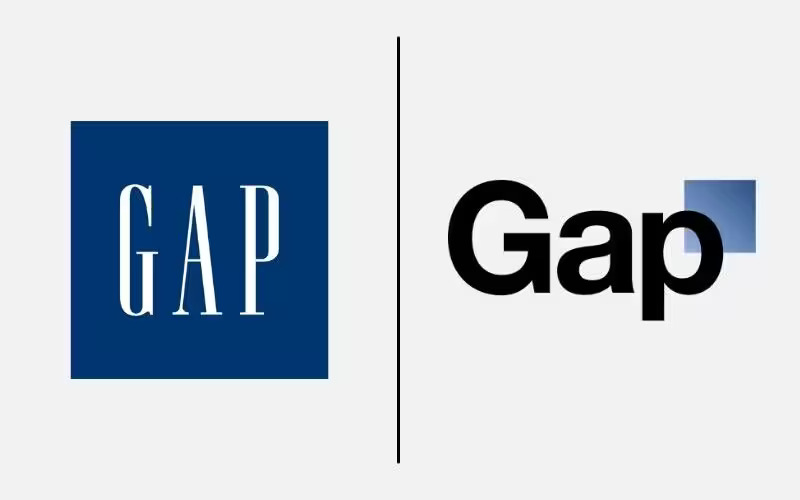
Image 1. Gap Logo Change (https://www.thebrandingjournal.com/2021/04/learnings-gap-logo-redesign-fail/)
Cracker Barrel, August 2025. Uncle Herschel, the old man leaning on the barrel, came off the logo and left the wordmark behind. Shares fell about 7.2%, roughly $94 million of market value, the US president posted about it, and the Old Timer was back in 8 days.
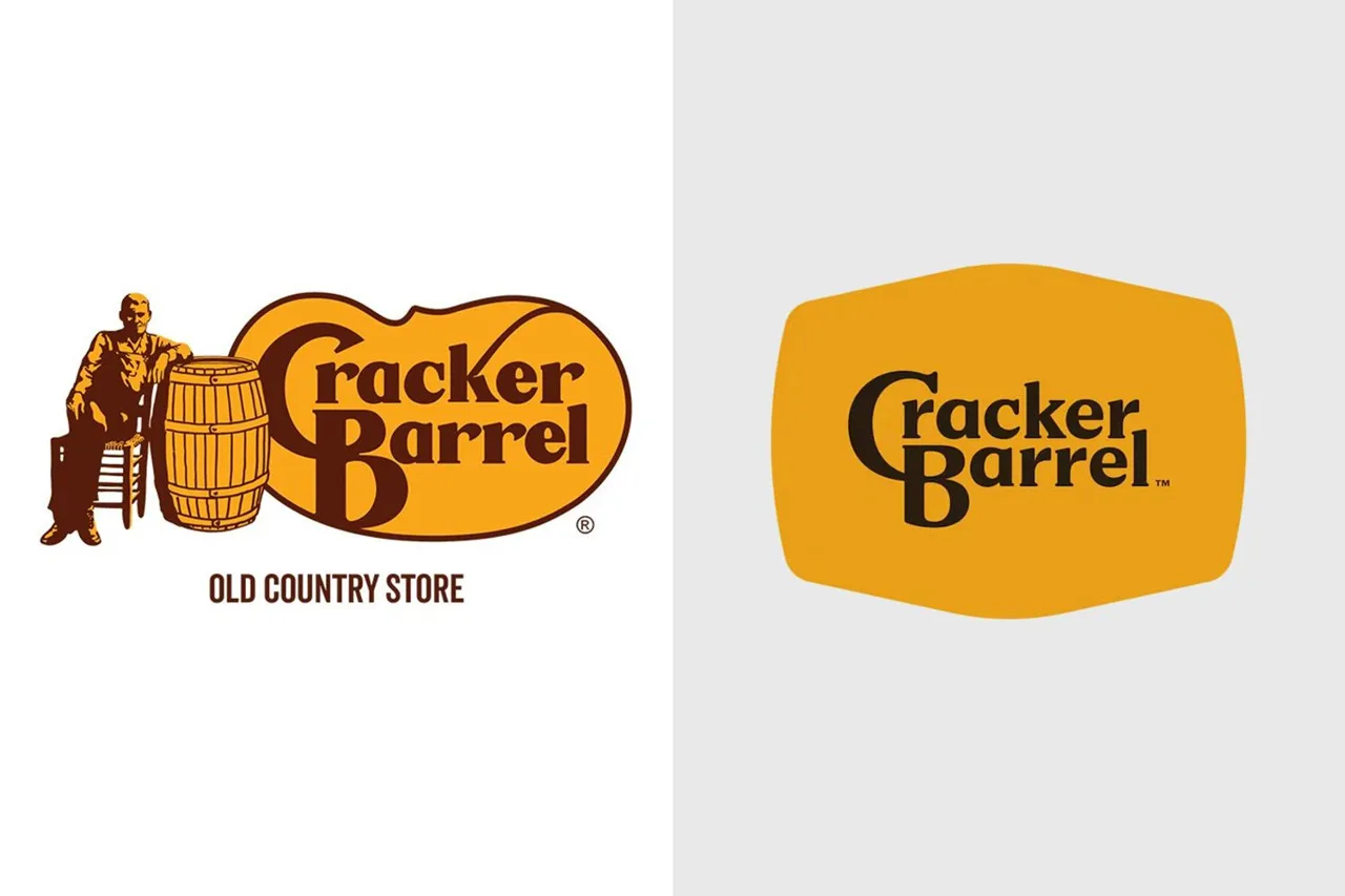
Image 2. Cracker Barrel Logo Change. (https://www.nrn.com/family-dining/cracker-barrel-ceo-addresses-its-brief-but-controversial-logo-change)
Tropicana, 2009. On January 8 PepsiCo put a new carton on shelves: a plain glass of juice where the orange with the straw in it used to be, a tidy wordmark, the cap restyled as something to squeeze, the whole job by Arnell Group. Ad Age's numbers, reported by Bloomberg, had unit sales down 20% and dollar sales down 19%, about $33 million, between New Year's Day and February 22. On February 23 PepsiCo said the old cartons were coming back.
The carton was definitely a cleaner design than the previous packaging, but it just wasn’t what people recognized. When the customer is rushing as they shop in the grocery store, they couldn’t easily grab for it anymore.
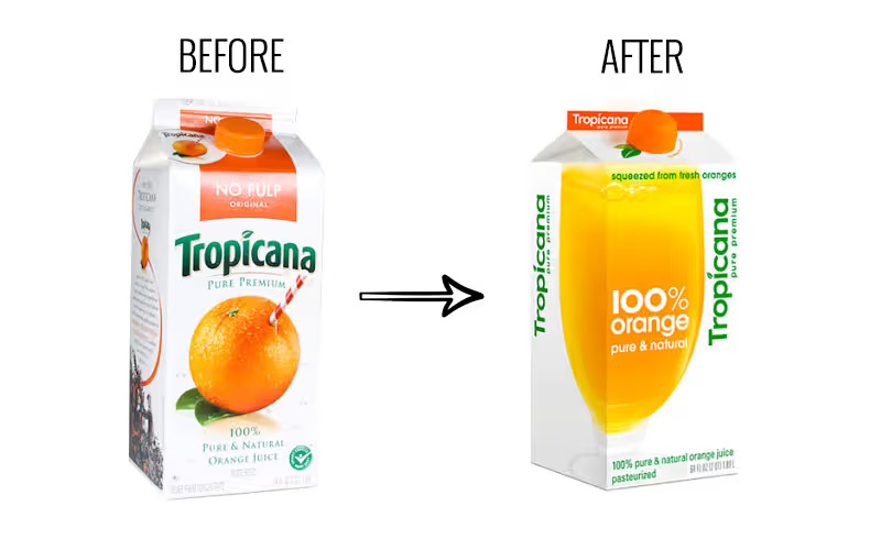
Image 3. Tropicana Packaging Change (https://www.thebrandingjournal.com/2015/05/what-to-learn-from-tropicanas-packaging-redesign-failure/)
SunChips, 2009 to 2011. Frito-Lay's compostable bag was the right idea and the loudest object in the grocery store, literally. One test put it near 95 decibels, louder than the New York subway at 91, while the company's own Tostitos bag sat at 77. An Air Force pilot who tested one said it beat the cockpit of his jet.
Forty-four thousand people joined a Facebook group called "Sorry But I Can't Hear You Over This Sun Chips Bag." as sales fell roughly 11%. In October 2010 five of the six flavours went back into the old plastic. A quieter version turned up in 2011 with an adhesive layer to deaden the crinkle, and by the end of that year the bags were gone from the US and Canada.
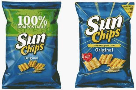
Image 4. SunChips Packaging change (http://www.greenmarketing.com/blog/comments/new-sun-chips-bag-proves-frito-lay-has-learned-its-green-lesson/)
Benadryl Extra Strength Itch Stopping Gel. The gel was for skin only but prior to the correction in 2010, there were 121 cases of people mistakenly swallowing it. The FDA's description of the problem, written up in 2008, was that the container was shaped like a four-ounce bottle of oral liquid medication with a tapered top, and that the gel's viscosity was thin enough to resemble an oral liquid rather than a gel. It didn’t help that it sat on the shelf beside Benadryl's oral liquids.
Johnson & Johnson's response was a prominent "For Skin Use Only." statement on the label, a sticker on the cap, and consumer studies into why people were swallowing it. Eventually, they redesigned the bottle into a squeeze tube design to distinguish it from their other products.
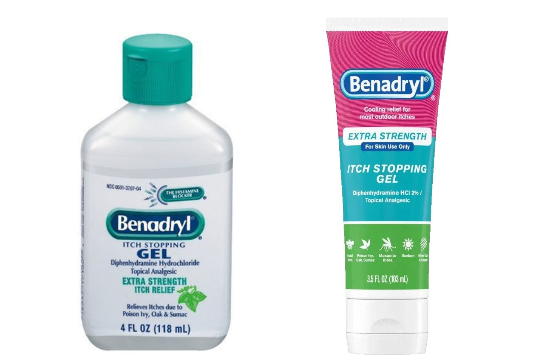
Image 5. Benadryl Itch Stopping Gel Packaging Change (https://www.benadryl.com/products/benadryl-itch-stopping-gel-extra-strength)
None of these started badly. Somebody wanted the brand to look like it belonged in this decade, or needed a logo that still read at forty pixels, or had a new audience in mind that the old look kept out, or had been told the old packaging cost too much to print. The work got made properly and the research got read and it went out and landed wrong anyway.
Putting it back is the cheap part. Cracker Barrel's shares rose about 7% the day it gave in. Tropicana paid for new cartons and then paid again to go back, and still lost about $33 million of juice in the seven weeks it took to decide. The slow two never made the ground up, with SunChips shedding roughly 11% of sales across eighteen months before the bag disappeared altogether, and nine years going by on the gel before anybody printed a sticker.
The money goes while you're waiting to find out whether the noise will die down. Nobody holds Gap's six days against them now, and the blue box is still a blue box.
If you’ve got a refresh coming, whether that’s packaging, a logo or a whole identity, we’d rather be in the room before it ships than after. Book a call with us today.